
The color of a living room cannot be chosen on a screen. Between the natural light that changes with the hour, the pigments that react differently from one eco-label to another, and the finishes that alter the perception of a shade, the subject goes far beyond personal taste. Painting a living room means dealing with physical and chemical constraints that color samples do not show.
VOC levels and dark colors: what labels do not treat equally
Choosing a paint color for a living room today involves looking at the label as much as the color sample. Highly pigmented shades (terracotta, deep blue, olive green) often require formulations that are higher in volatile organic compounds.
The differences between labels are significant. The European Ecolabel limits VOCs to 15 g/L for indoor wall paints, while the NF Environment certification caps them at 30 g/L. Ecocert, on the other hand, goes down to just 3 g/L. For the same sage green or the same midnight blue, the chemical composition can therefore vary from simple to tenfold depending on the manufacturer and its label.
This point has direct consequences on color choice. A living room where one spends several hours a day deserves special attention to indoor air quality. Opting for a strong shade while staying below a low VOC threshold reduces the range of available brands. Consulting a living room paint color guide helps identify ranges that combine intense pigmentation and clean formulation.
The criteria of the European Ecolabel have also been tightened recently, with a compliance deadline set for June 18, 2027, according to Bureau Veritas. Some less virtuous colored paints will gradually disappear from the market, particularly in bright and dark ranges. Anticipating this evolution prevents finding oneself with an unavailable shade at the time of touch-ups.
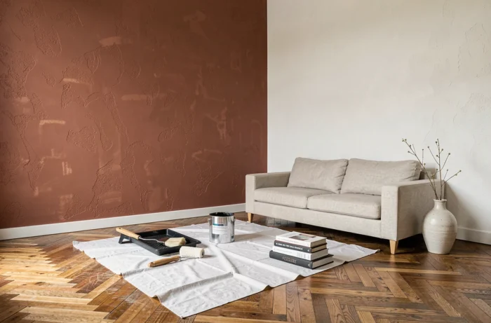
Paint color and natural brightness of the living room
The light that enters a living room radically transforms the perception of a color. A pearl gray placed in a north-facing living room will appear cold and slightly bluish, whereas the same gray, bathed in southern exposure, will lean towards warm beige by the end of the day.
North-facing rooms receive indirect, cold, and constant light. Warm shades compensate for this deficit without darkening the space: soft ochre, linen yellow, powder pink. Conversely, a pure white in this configuration appears dull and flat.
A south or west-facing living room benefits from generous sunlight. Colors gain intensity throughout the day. Cool tones (blue-gray, water green) work better in these orientations because the warm sunlight naturally warms them. Applying a saturated terracotta on a south-facing wall risks creating a feeling of visual suffocation in summer.
The real-world test remains the only reliable method
Applying a paint sample on two different walls of the living room, then observing the result in natural light in the morning and in artificial light in the evening, remains the only way to avoid unpleasant surprises. Online simulators and paper color samples do not reproduce the actual light variations of a furnished room.
The sample must cover a sufficient area for the eye to judge the effect from a distance. A square that is too small skews the perception of the shade.
The 60-30-10 rule applied to the living room
Rather than choosing an isolated color, the approach that yields the most coherent results is to think in proportions. The 60-30-10 rule, borrowed from professional decoration, structures the distribution of shades in the living room:
- 60% dominant color on the main walls, which sets the overall tone of the room (off-white, light gray, sand beige)
- 30% secondary color on a wall, furniture, or textiles, to add character without saturating the space
- 10% accent color in decorative objects, cushions, or lighting, to create focal points
This distribution works because it reproduces a natural visual balance. A living room painted entirely in a strong shade can be visually tiring. Conversely, a space that is too neutral lacks depth.
The choice of the dominant color depends on the area and ceiling height. Light shades visually enlarge a small living room, while a dark color brings the walls closer and creates an enveloping atmosphere in large volumes.
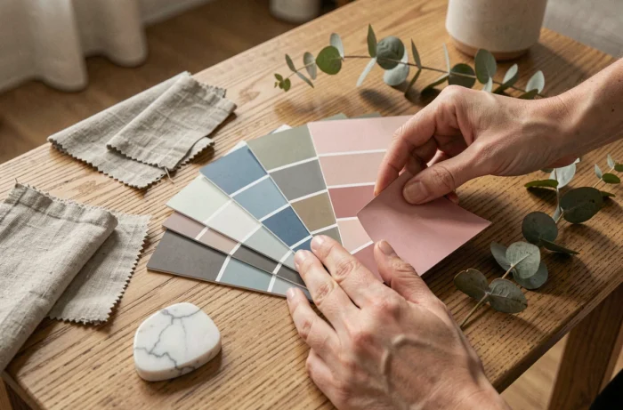
Matte, satin, or glossy finish: the impact on perceived color
The finish modifies the color as much as the pigment itself. A midnight blue in a matte finish absorbs light and appears deeper, more muted. The same midnight blue in a satin finish partially reflects light and seems lighter, more vibrant.
For a living room, three finishes deserve comparison:
- The matte finish hides wall imperfections and gives a velvety appearance, but it does not resist wear and stains as well
- The satin finish offers a compromise between aesthetics and durability, suitable for living room walls that are used daily
- The glossy finish amplifies intense colors but reveals every surface irregularity, making it suitable only for perfectly smooth walls
The choice of finish also interacts with brightness. In a dark living room, a satin finish reflects more light than a matte finish and visually lightens the atmosphere. In a very bright living room, a matte finish softens reflections and calms the atmosphere.
Testing the same shade in two different finishes on a wall allows one to see the difference. It is often more pronounced than one might imagine, especially on medium colors (greens, blue-grays, powder pinks) where the reflection of light significantly alters the perception of the pigment.
The living room remains the space where paint is experienced the longest every day. A choice informed by the constraints of light, chemical composition, and finish avoids the disappointment of the final result, the kind that leads to repainting six months later.