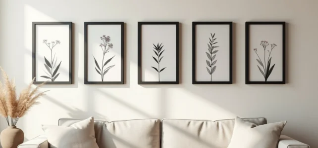
Five identical frames leaning against the living room wall, still in their packaging: we all know this situation. The format is the same, the color of the frame too, and it is precisely this uniformity that complicates the arrangement. Poorly placed, they create a catalog effect. Well thought out, they structure an entire wall and create a true focal point in the room.
Width of the composition in relation to the furniture: the constraint we forget
Before drilling anything, we look at what is under the wall. Sofa, console, sideboard: the furniture below dictates the maximum width of the composition. Recent sources on gallery walls recommend limiting the total width of the frames to about 60 to 75% of the width of the furniture located underneath, to avoid a massive or disproportionate effect.
Specifically, if your sofa is two meters long, the composition should not exceed one meter fifty in width. This proportion also works above an entry console or a low sideboard. We often tend to center the frames on the wall itself, while it is the alignment with the furniture that creates visual coherence.
For those looking for ideas for arranging 5 frames on a wall, this furniture/composition width ratio is the first reflex to adopt before choosing a layout.
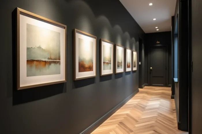
Staggered line arrangement: breaking the monotony without losing alignment
The perfect horizontal line, five frames edge to edge at the same height, works in a narrow corridor or above a headboard. Elsewhere, it flattens the wall.
A more interesting variant: keeping a common horizontal axis but staggering one or two frames up or down. The center of each frame remains on the same imaginary line, except for two of them which slide a few centimeters. This maintains a linear reading while introducing a visual rhythm.
To keep the stagger harmonious, we maintain a regular spacing between each frame. Most decorators work with an identical gap between all frames in a homogeneous composition, usually the width of two or three fingers.
Asymmetrical cross hanging: a graphic arrangement for free walls
On a wall without furniture underneath (a wall section in a staircase, a wide corridor wall, space between two doors), the asymmetrical cross gives a very graphic result with five identical frames.
The principle: one central frame, then four frames distributed around it, but not symmetrically. Two frames on the left (one above the other), two on the right (staggered in height compared to the first two). The central frame anchors the composition, while the other four create movement.
- Place the central frame at eye level, about 1.60 m from the floor, as the starting point for the entire arrangement.
- Position the two left frames in a tight column, with reduced spacing between them.
- Stagger the two right frames: one aligned with the top of the central frame, the other lower than the central frame, to break the symmetry.
This type of arrangement highlights a wall with a high ceiling. Opinions vary on this point, but the asymmetrical cross works best when there is at least two meters fifty of available height.
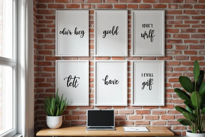
Arc or wave composition: exploiting the verticality of the wall
Less common than the grid or line, the arc arrangement involves placing the five frames along an imaginary curve. Starting from a low frame on the left, we gradually rise to the central frame (the highest), then descend to the right.
The arc creates a natural movement that guides the eye from one end of the wall to the other. This arrangement adapts particularly well above a rounded piece of furniture (round table, console with curved edges) or in a space where the wall itself has an atypical shape.
To trace the arc before drilling, cut five pieces of paper to the exact dimensions of the frames, attach them to the wall with repositionable tape, and adjust until the desired curve is achieved. This step avoids unnecessary holes and allows for visual validation from a distance.
60-30-10 color rule applied to frames and the wall
When the five frames are identical, it is the content (photos, illustrations, posters) and the wall that determine the color harmony. The 60-30-10 rule, used by decorators to distribute colors in a room, applies directly here.
- 60% dominant color: this is the wall itself. A white, beige, or light gray wall plays this role effortlessly.
- 30% secondary color: the frames and mats. With five natural wood frames on a white wall, the wood becomes the secondary color.
- 10% accents: these are the images in the frames, which bring strong or contrasting hues. Choosing visuals that share a common palette (blue tones, black and white, sepia) unifies the whole.
This approach prevents visually saturating the wall. Five identical frames with images in disparate colors result in a messy outcome, even if the geometric arrangement is perfect. Harmony comes as much from color as from spacing.
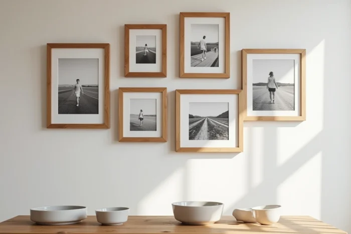
The last point to keep in mind: a composition of five identical frames should always be tested on the floor before going on the wall. Lay the frames on the ground, reproduce the intended spacing, step back a few paces. What seems balanced up close often reveals itself to be unbalanced from three meters away, and it is from the sofa or the entrance of the room that one looks at a wall, not with one’s nose against it.